The latest stable version of Bootstrap was released on 5th May 2021. Bootstrap is the most popular CSS framework for developing responsive and mobile-first websites.
Now, let's move towards our problem:
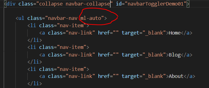
Using Bootstrap say if we build Navigation-Bar as shown in the image below:

Simply we have to add "justify-content-end" to the parent class as shown below:
By adding this class to the parent and when we save the code we see that the element that we wanted to shift has shifted to the right as shown below:


So this is the solution to this problem.
I hope it helped you.
Thank you
Utkarsh Gupta
Utkarsh Gupta